
The Identity Shift: Why WhatsApp’s New ‘You’ Tab is More Than Just a Facelift
How version 16.5.10.73 signals a new era for account management, identity expression, and the long-awaited arrival of multi-account support on iOS.

1. Introduction: The Subtle Evolution of Our Digital Home
We live in an era governed by invisible interfaces. For the modern smartphone user, the applications we frequent most—the ones that hold our intimate conversations, our family memories, and our professional livelihoods—become a form of digital muscle memory. We do not "think" about navigating to our settings or checking our messages; our thumbs move with a subconscious precision developed over thousands of hours of repetitive interaction. Because of this deep-seated familiarity, even the most microscopic change to the visual architecture of an app can feel like someone has quietly rearranged the furniture in your childhood home while you were sleeping. You open the app, and for a split second, you feel a sense of friction—a momentary pause where the expected path has shifted, and the "ghost" of the old interface still haunts your fingertips.
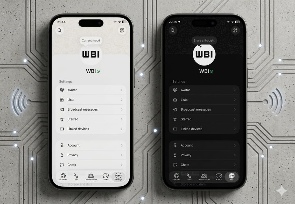
This is the exact sensation currently being experienced by millions of WhatsApp users on iOS. With the release of version 16.5.10.73, the world’s most ubiquitous messaging platform has initiated a change that is seemingly minor on the surface but profound in its strategic implications. The familiar "Settings" gear, a staple of the interface for over a decade, is disappearing. In its place sits a new icon: your own face.
This transition from "Settings" to "You" is a pivotal moment in the history of the app. It marks the point where WhatsApp officially moves away from being a mere utility—a tool for sending packets of data from point A to point B—and begins its final transformation into a platform of identity. It is no longer just about adjusting the mechanics of the software; it is about inhabiting a digital profile. As we peel back the layers of this update, we find that the "You" tab is not just a aesthetic facelift; it is the cornerstone of a much larger architectural shift involving multi-account support, personal branding, and the unification of the Meta ecosystem. In the tech world, there are no accidents in UI design. If a gear icon disappears, it is because the very definition of the "machine" has changed.
2. Goodbye, Gear Icon: The Rise of the 'You' Tab
For as long as iOS has existed, the stylized gear icon has served as the universal shorthand for "mechanics." It is the hood of the car, the back of the watch, the place where you go to fix things, toggle notifications, manage storage, and adjust privacy. It is a symbol of the machine—a cold, industrial representation of control. By replacing this mechanical icon with the user’s profile photo, WhatsApp is fundamentally altering the user’s mental model of the application.
The change, first spotted in TestFlight betas and now officially rolling out in the version 16.5.10.73 App Store release, replaces the "Settings" label with the word "You." This is a significant linguistic shift. "Settings" is a verb, an action you perform upon a tool; "You" is a state of being. This shift humanizes the interface, moving the focus away from the "tool" and toward the "individual."
When you tap your own photo to access your preferences, the emotional connection to the interface changes. It feels less like navigating a menu and more like visiting your own digital space. This isn't just a design choice; it's a statement of intent. As the official release notes for version 16.5.10.73 state:
"The settings tab is now a profile tab, where you can manage your account, control your identity, and express yourself."
This language—"control your identity" and "express yourself"—is a far cry from the utilitarian roots of a platform that once prided itself on having "no ads, no games, and no gimmicks." It signals a move toward self-expression that has historically been the domain of social media platforms like Instagram rather than dedicated encrypted messaging apps. The "You" tab acts as a central hub for this new focus, centralizing the user's presence within the app and forcing us to acknowledge that our digital tools are no longer separate from who we are.
3. The Multi-Account Foundation: Reading Between the UI Lines
While the aesthetic changes are what users will notice first, the strategic logic behind this shift is grounded in a long-requested feature: multi-account support. For years, iOS users have struggled with the limitation of one WhatsApp account per device. For the professional who needs to maintain a separate line for clients, or the traveler who maintains a local and international number, this has been a point of constant friction. Many have been forced to carry two physical phones or resort to complex third-party workarounds that often compromise security.
The "You" tab is the essential UI foundation for solving this problem. The logic is simple yet effective: if a user is managing multiple accounts on a single device, they need an instantaneous, visual way to know which identity is currently active. By placing the profile photo prominently in the bottom navigation bar, WhatsApp provides a persistent visual cue. You no longer have to dig through four layers of menus to see if you are replying as "John the Executive" or "John the Friend"; your active identity is always visible in the corner of your screen.
To understand the weight of this change, consider the "Side-Hustle Hero" of 2026. This user might manage a personal account for family, a business account for their freelance consultancy, and perhaps a community account for a local non-profit. In the old "Settings" paradigm, switching between these would be a cognitive minefield, prone to the "wrong-chat" errors that can destroy professional reputations in a heartbeat. The "You" tab mitigates this risk through visual confirmation.
This follows a proven design pattern within the Meta ecosystem. Both Instagram and Threads utilize this exact UX strategy, replacing the generic profile icon with the specific user’s photo when multiple accounts are linked. By aligning WhatsApp with this pattern, Meta is creating a cohesive cross-platform experience. It is a subtle nudge toward the "Account Center" philosophy, where your identity is a portable asset that moves with you across different apps. This update isn't just about a new icon; it's about building the framework for a future where one device can hold multiple digital personas without the risk of cross-account confusion, essentially ending the era of the "work phone."
4. Personal Branding in Your Pocket: The Cover Photo Revelation
Furthering this theme of identity, the 16.5.10.73 update introduces a feature that has traditionally been reserved for "public" social profiles: the cover photo. WABetaInfo and early-access users have noted that WhatsApp has begun refreshing the profile page within the "You" tab by adding a default cover photo at the top of the screen.
In the context of a messaging app, a "large header" or cover photo might seem like an unnecessary addition. Why does a chat app need a banner? However, from a UX perspective, it represents a move toward "personalization" and "visual recognition." The cover photo provides a visual anchor for the profile, enhancing the overall look and making the page feel more complete. It moves the profile from a list of text-based settings to a visual "home page."
There is, however, a catch that highlights the early stages of this rollout. Currently, the availability of the cover photo is limited, and for those who do have it, it is restricted. Users are currently assigned a default image and must wait for future updates to replace it with a personal image. According to the ground truth provided by 9to5Mac, users currently cannot change their cover photo.
This "restricted" state is a classic software deployment strategy. By introducing the visual space for the cover photo before allowing full customization, WhatsApp can test the interface’s stability and responsiveness without the added complexity of billions of user-uploaded images flooding the servers at once. It is a sign that WhatsApp is prioritizing the "enhanced look" of the experience.
Think of this as the "Business Card" effect. As WhatsApp Business continues to grow, these cover photos will likely become essential branding real estate for companies. Imagine a local bakery using the cover photo to show today’s specials, or a consultant using it to display their professional credentials. By bringing this to the personal "You" tab first, Meta is normalizing a level of visual branding that was previously absent from the platform.
5. The "Liquid Glass" and the Rollout Lottery
One of the most modern frustrations of being a tech-literate user is the "staged rollout." Even when an update like version 16.5.10.73 is officially listed on the App Store, there is no guarantee that every user will see the features immediately. This "rollout lottery" is particularly evident with the current WhatsApp update cycle, and it brings us to a fascinating design concept: "Liquid Glass."
Reports indicate a significant "feature lag" for many users. Marcus Mendes, writing for 9to5Mac, noted that he—along with many others—has been missing the "Liquid Glass" interface since it first began rolling out in October of last year. This highlights the immense complexity of deploying updates to an app with billions of users.
"Liquid Glass" represents a specific aesthetic philosophy. It is an evolution of the "Glassmorphism" trend, where UI elements have a translucent, frosted-glass quality that mimics physical depth and light refraction. It is a departure from the "Flat Design" era of the mid-2010s, moving instead toward something more organic and fluid. When combined with the "You" tab and the new cover photos, we see a vision of WhatsApp that is more visually sophisticated than it has ever been.
Why the delay? High-stakes apps like WhatsApp cannot afford to "break." A bug in the navigation bar of a niche app is an annoyance; a bug in the navigation bar of WhatsApp is a global communication crisis. Every change to the UI must be stress-tested across millions of device configurations, languages, and legacy hardware. The "You" tab may reach some users today, while others may find themselves looking at the old gear icon for weeks or even months to come. It is a reminder that in the world of global-scale software, the "App Store" date is merely the starting gun for a very long marathon.
6. The Meta-Morphosis: Aligning with the Broader Ecosystem
To understand why the "You" tab matters, one must look beyond WhatsApp and toward the broader Meta ecosystem. For years, Meta has been working toward a "unified identity" through its Account Center. By bringing the UI patterns of Instagram and Threads—specifically the identity-centric profile tab—into WhatsApp, Meta is ensuring that the user experience is cohesive across all platforms.
This is a branding exercise as much as it is a UX improvement. When a user switches from Instagram to WhatsApp, they shouldn't feel like they are stepping into a different world with a different set of rules. The "You" tab acts as a bridge, making the Meta experience feel like a single, unified environment. Whether you are posting a photo on Instagram, sharing a thought on Threads, or messaging a client on WhatsApp, your digital identity is handled through the same visual language.
This "Meta-morphosis" suggests that the company views "Identity" as the central product, rather than the individual features of each app. In this worldview, the apps themselves are just different "rooms" in which that identity can interact. The move away from the "Settings" gear is a symbolic departure from the era of apps-as-tools and an entry into the era of apps-as-ecosystems.
We are moving toward a future where "logging in" is a singular event that unlocks a suite of interconnected experiences. The "You" tab is the visual proof of that unification. It says: "You are the same person here as you are there." For Meta, this is a powerful play for user retention—the more cohesive the ecosystem, the harder it is to leave.
7. SEO Deep-Dive: Why Identity-Centric Design Matters in 2026
As we look at the trends of 2026, the shift from "Utility" to "Experience" is the defining theme of Human-Computer Interaction (HCI). In the early days of mobile technology, the goal was efficiency: how quickly can I send this text? How easily can I change my notification sound? As the market has matured, efficiency has become a baseline expectation. The new differentiator is "Experience"—how does using this app make me feel, and how does it represent me to the world?
The "WhatsApp iOS update" and the introduction of "Multi-account support" are the technical keywords that drive search traffic, but the real story is "Digital Identity." In 2026, our digital presence is no longer a secondary version of ourselves; for many, it is the primary way they interface with the world. Therefore, the tools we use to manage that presence must reflect that importance.
Identity-centric design acknowledges that the user is the most important part of the software. By prioritizing "You" over "Settings," WhatsApp is acknowledging the shift in how we perceive our relationship with technology. We are no longer just "users" of an app; we are "residents" of a digital space.
This trend also reflects the growing need for "Contextual Computing." Our lives are no longer monolithic. We are parents, employees, hobbyists, and citizens, often all at once. The visual cues provided by the "You" tab are a crucial step toward a more intelligent, context-aware interface that can keep up with the complexity of modern life. When the software knows "who" you are in a specific context, it can serve you better. The "You" tab isn't just a place to change your profile picture; it’s a command center for your digital life.
8. Conclusion: A Profile That Finally Feels Like You
The release of WhatsApp version 16.5.10.73 is far more than a minor tweak to the navigation bar. It represents the death of the "Settings" menu as we know it and the birth of a more personalized, identity-focused interface. By preparing the ground for multi-account support, introducing the visual real estate of cover photos, and aligning with the broader Meta design language, WhatsApp is signaling its future as a comprehensive social and professional ecosystem.
As the gear icon fades into history, replaced by the faces of billions of users, we are left to wonder about the long-term impact of this shift. We are moving toward a world where our apps are more than just utilities; they are extensions of ourselves. The "You" tab is a mirror, reflecting our own presence back at us every time we open the app.
The question for the future is this: As our messaging apps become more like social profiles, are we losing the simplicity that made them essential in the first place? Does the addition of cover photos and "Liquid Glass" interfaces add unnecessary weight to a tool that was once valued for its lean efficiency? Or is the "You" tab the final, necessary step in WhatsApp’s journey from a simple texting tool to a full-fledged social ecosystem that finally feels like home?
Regardless of the answer, one thing is clear: the next time you open WhatsApp and see your own face staring back at you from the bottom corner, know that you aren't just looking at a new icon. You are looking at the future of digital identity. The machine is gone; only you remain.
About the Creator
Tech Horizons
Exploring the future of technology, AI, gadgets, and innovations shaping tomorrow. Stay updated with Tech Horizons!
Keep reading
More stories from Tech Horizons and writers in Futurism and other communities.
The $3,000 Experiment: Why Samsung Just Killed the Galaxy Z TriFold After 90 Days
The world of consumer technology is rarely defined by products that succeed by disappearing. On March 17, 2026, Samsung Electronics executed what can only be described as a controlled demolition of its most ambitious hardware project in a decade. The Galaxy Z TriFold—a device that promised to collapse the boundary between the smartphone and the workstation—was officially moved to "inventory-depletion" status.
By Tech Horizons13 days ago in Futurism
How machines can learn from human behaviour
In order to understand where we are and where we are going, we need to understand where we were first. - Susan Fourtane Could a human behaviour simulator be embedded into a robot or online avatar to the point that it’s hard to distinguish between a real person or artificial intelligence? Scientists have been upping the stakes in this “Turing test” for years, to the point that human-mimicking programmes are ready to answer tricky questions, assist people with online shopping or be companions.
By Susan Fourtané 12 days ago in Futurism
Adhesives and Sealants Market Outlook: Sustainable Formulations & Emerging Applications
According to IMARC Group's latest research, the global adhesives and sealants market size reached USD 72.4 Billion in 2025. Looking forward, IMARC Group expects the market to reach USD 105.1 Billion by 2034, exhibiting a growth rate (CAGR) of 4.10% during 2026–2034.
By sujeet. imarcgroup4 days ago in Futurism
The Irony of Flying While We Bomb the "World's Greatest Terror Regime"
Ah, the irony of flying at this moment in time as the United States is simultaneously bombing Iran - the nation officials have insisted for decades is "The World's Greatest Terror Regime" - while the TSA is on a go-slow, courtesy of a funding squeeze that's left its officers unpaid, quitting in droves, and turning checkpoints into something like slow-moving bread lines.
By Scott Christenson🌴7 days ago in Humor


Comments
There are no comments for this story
Be the first to respond and start the conversation.