
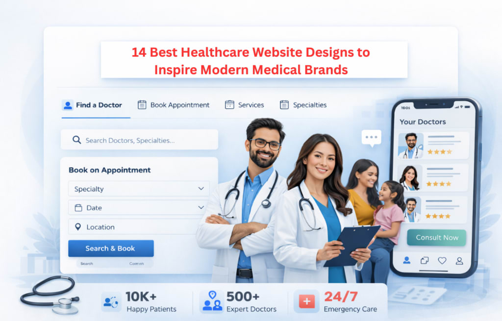
14 Best Healthcare Website Designs to Inspire Modern Medical Brands
Best Healthcare Website Designs
A Better Way to Navigate Care
People visiting a healthcare website aren't browsing for fun. They're looking for a doctor, trying to understand a symptom, or booking something urgent. That's a very different mindset from someone shopping for a product. That's why the best healthcare websites don't try to impress. They try to help. Fast load times, simple navigation, and clear next steps matter more than visual flair. According to Google, over 60% of healthcare searches now happen on mobile, which means if your site is slow or hard to use on a phone, you're losing patients before they even read a word. That’s why modern healthcare websites are starting to focus more on usability than design trends. The platforms that get this right make it easy for users to take action quickly without confusion or delay. Here are 14 platforms that get it right, and what you can actually take from each one.
14 Best Healthcare Website Designs
The following are some of the best healthcare website designs that focus on real user needs, not just visuals. Each one shows how better UX, performance, and structure can improve both experience and conversions.
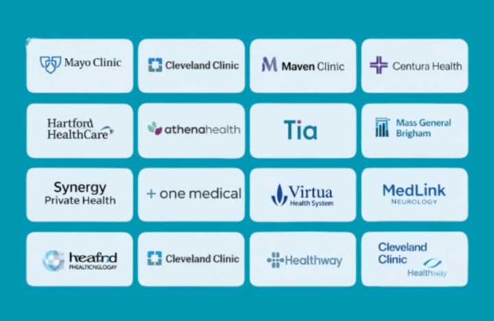
1. Mayo Clinic: Search That Understands What Patients Actually Mean
Most people searching for health information don't know the exact medical term they need. Mayo Clinic's search is built for that reality. It reads intent, not just keywords, and it's backed by structured data markup that helps both users and search engines find the right content fast. The takeaway: if your site carries a lot of clinical content, intent-based search and proper content hierarchy will do more for your users than any redesign.
2. Cleveland Clinic: Two CTAs, Done Right
Find a doctor. Book an appointment. That's it. Both are above the fold and are visible on mobile. Cleveland Clinic's flat navigation keeps users within two or three clicks of anything they need. It also scores well on Core Web Vitals, meaning the page loads without content jumping around. Most people are unaware of how important that is, particularly for elderly users on slower connections.
3. Maven Clinic: Onboarding That Feels Like a Product, Not a Form
Maven's sign-up flow uses progressive disclosure, meaning it only shows users what's relevant to their current step. No overwhelming screens. No guessing what comes next. The most frequent reason subscription-based healthcare services lose users is during onboarding, which is lessened by this type of guided experience. It's also HIPAA-compliant under the hood, handling sensitive intake data with proper encryption throughout.
4. Centura Health: Warm Design That Keeps People on the Page
Soft colors, real photos of patients and staff, and clean spacing. Centura doesn't look like a hospital. It looks like a place that cares, and that matters for engagement. Worth noting: the image-heavy layout still performs well because they use WebP format and lazy loading. You can have both a fast page speed and an emotive design.
5. Hartford HealthCare: Video Done Without the Speed Hit
Video-based patient narratives and procedure explanations are effective because they foster confidence more quickly than written ones. Hartford pulls this off without slowing the page down by deferring video load until the user actually interacts with it. That's a small technical decision with a big impact. Longer sessions, more trust, better conversion, and no performance penalty.
6. Athenahealth: B2B Healthcare UX That Shortens the Sales Cycle
Athenahealth speaks to hospital administrators and clinical staff at the same time, with separate content tracks for each. Feature pages explain real workflow impacts, including EHR interoperability details and FHIR API capabilities, not just generic benefit statements. Buyers have fewer objections when they are able to educate themselves on technical fit before to a sales call. That's the commercial value of well-structured B2B UX.
7. Tia: What Happens When You Design for a Specific Patient
Bold type, direct tone, minimal clinical imagery. Tia is designed for younger women seeking proactive care, and everything on the site reflects that. It would feel out of place for a general hospital audience, and that's the point. The main idea is not to copy Tia’s design. It’s about understanding your audience clearly so you can make the right design decisions instead of using common healthcare templates.
8. Mass General Brigham: How to Scale Without Losing Usability
Multiple hospitals, dozens of specialties, thousands of pages. Mass General Brigham keeps this manageable through a headless CMS architecture where content is created centrally and delivered consistently across every section of the site. Each department manages its own content, but the UX stays uniform. That's the only way to maintain quality at enterprise scale.
9. Synergy Private Health: Less Is More for Premium Positioning
Synergy's site is sparse. Very few elements, a lot of white space, and nothing that doesn't need to be there. For a private healthcare provider, that restraint signals quality. It also performs well technically. Less page weight means faster LCP (Largest Contentful Paint), which is a direct Google ranking factor. Premium design and strong SEO can go hand in hand.
10. One Medical: Membership UX Built on Transparency
Pricing is shown clearly from the beginning. Benefits are clearly listed. The booking form is short and validates in-line, so users don't lose progress. One Medical applies standard SaaS product UX to healthcare, and it works. Transparency at the start of the funnel reduces hesitation. Making the booking process smooth removes the final obstacle between user interest and action.
11. Virtua Health System: Geolocation UX for Local Access
Virtua allows users to quickly filter services and appointments based on location. That's especially useful for urgent care situations where "nearest available" matters more than anything else. Paired with properly structured LocalBusiness schema markup, this also supports strong rankings for "near me" searches, which consistently convert at higher rates in healthcare.
12. MedLink Neurology: Going Deep on One Topic Beats Going Wide on Many
MedLink covers neurology and nothing else. The content is focused, the navigation is narrow, and users aren't distracted by unrelated services. Topical depth like this also tends to build stronger SEO authority in a niche than a general health platform covering the same subject in two paragraphs. For specialist providers, narrow and deep is usually the right strategy.
13. Cleveland Clinic Global: One Design System, Many Markets
Cleveland Clinic’s global sites may change language, but the design system stays the same. Navigation structure, interaction patterns, and visual language stay consistent across every region. That's possible because design tokens and a shared component library sit at the center of the system. Regional teams localize content without rebuilding UI. That's the right architectural split for any healthcare brand operating across markets.
14. Healthway: Clean and Simple with a Creative Touch
Healthway uses a clean layout with plenty of white space, making it easy to read and navigate. The simple header and structured footer help users find information quickly. Small elements like the parallax background add a modern feel without making the design heavy. It’s a good example of how a simple design with a few creative touches can improve user experience.
The Shift Toward Practical Healthcare UX
Good healthcare website design is not about adding more features; it’s about making things easier for the user. The platforms above show that simple navigation, fast performance, and clear actions can directly improve both user experience and conversions. If you’re planning to build or improve your platform, working with an experienced Healthcare Website Development Company can help you create a solution that is not only user-friendly but also scalable and performance-driven.
About the Creator
Maitrii
Tech writer covering AI, software, tools and technology, digital trends, and breakthrough innovations shaping the modern tech world.
The Fascination with Luxury Timepieces and the Rise of Replica Culture
Luxury watches have long represented more than just a way to tell time—they symbolize craftsmanship, prestige, and personal identity. Brands like Richard Mille and Panerai have cultivated global admiration through innovation, design, and heritage. However, alongside this admiration, a parallel market has emerged that reflects a different kind of consumer interest: the growing demand for replicas. Terms such as Richard Mille watches (理查德米勒手錶 ), high replica Richard Mille (高仿理查德米勒 ), Panerai watches(沛納海手錶), high replica Panerai (高仿沛納海), and replica Panerai (復刻沛納海 ) are increasingly searched online, highlighting a complex shift in how people engage with luxury.
By charliesamuel5 days ago in 01


Comments
There are no comments for this story
Be the first to respond and start the conversation.